|
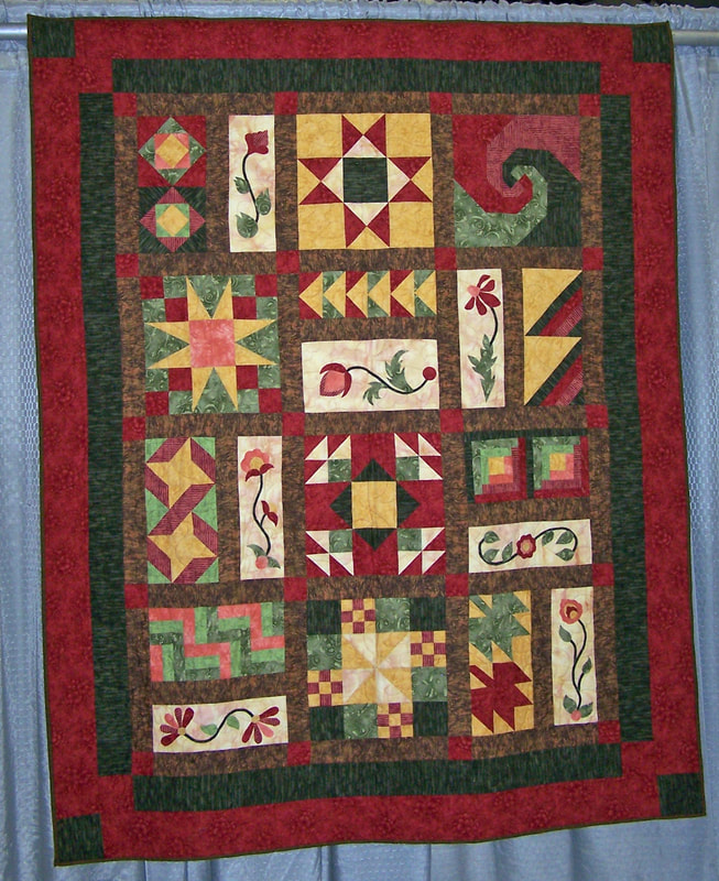
How do we step up to design and color? Most quilters want to step up. Many feel insecure about their fabric and color choices. They may stick to patterns because someone else has handled all that design stuff for them. And judges and candidates? You don’t have a choice, you have to step up. Color and design are among the most difficult areas to gain facility with on the road to being a good certified judge. It needs more from us than determining if all the points in a group of star blocks on the quilt are sharp or cut off. I have done my share of interest surveys within my guild and for events I have organized and I can tell you that color and design are always near the top of the list of things quilters want to learn more about. So a class or lecture is scheduled. People attend. The presenter steps up and….. the presenter usually pulls out a color wheel or begins to list the elements of design. And having been the teacher or lecturer plenty of times, I can tell you that within, at best, 2 minutes, the eyes of maybe 75% of the audience have glazed over and their heart and breathing rates have dropped to something normally seen in a state of semi-consciousness. The remaining 25% will have joined them by the 10 minute mark. It takes a highly motivated student to stick with your standard color and design presentation. Face it: color and design are intimidating topics to learn and verbalize and more intimidating to manipulate confidently in your quilts. I don’t think it has to be that way. At some point in art history, commonly agreed upon words evolved that gave people a vocabulary with which to discuss color and design. It was great to have these words because color and design are, at heart, very abstract things and the words provided a tool for conversation. Color and design themselves did not come into existence when the words finally showed up. They were already there, visible and observable, with their visual and emotional impact, before anyone ever said 'tertiary color' or 'crystallographic symmetry.' But the design and color words, what most classes and lectures start with, are not the first step. First you have to learn to look. Think of it as learning a language. You come to class. There is a picture of a lamp. You then see or hear the Russian word for lamp. You connect the Russian word to the visual cue of the lamp and your understanding of what a lamp is, and your Russian vocabulary just increased. This would not be the case if you did not see the lamp, if instead someone just kept repeating the Russian word at you or showing you a flash card of the word lamp written in the Cyrillic alphabet. You would have nothing to connect to the Russian word. Not only would you not learn anything, you would eventually become irritated and mentally check out. Et voila! Glazed over and semi-conscious. Another educational triumph. Before you can learn color and design, you have to see the picture of the lamp, so to speak. You have to learn to notice design and color before any of the words have meaning for you. And here’s the good news: you probably already do. You just have to be aware of it. (I’m pretty sure that people who manage to get benefit from the study of design and color aren’t some kind of born artists, they just know how to look, which gives them a visual framework to hang the concepts on. Oh, yeah, and they never really stop studying.) So in the interest of not going glassy-eyed and semi-conscious, we are going to begin to evaluate design and color, without any of the design and color words. Let’s look at a quilt BUT don’t pay attention to the quilt. Pay attention to what your eyes do while you look at the quilt. We are going to find the path through the quilt. Before you look at the quilt below, read these questions and use them to help you pay attention to what your eye does when you finally get to look at the quilt. Do not attempt to decide if it's a good design or not, whether or not the colors work, what could be done better etc. etc. None of that. No evaluation of the quilt. This is about what your eyes do, given the stimulus of the quilt.
OK, now you can look at the quilt. Next week I'm going to tell you what my eye does when I look at this, and why I think it does it. I'm going to formulate some judge's comments based on my obsrvations, and then, and only then, will I toss around some color and design words. Next: Learning to See Design 2 Stacy Koehler, Secretary, NACQJ NQA Certified Judge Qualified to Evaluate Masterpiece Quilts
1 Comment
|
AuthorStacy Koehler became an NQA Certified Judge in 2005. She is a current member of the National Association of Certified Quilt Judges and has served as the new organization's Secretary. She loves quilts and quilters and believes that a well-judged quilt can be a positive influence in its maker's individual development and contribute to the continued growth of the art of quiltmaking. Archives
July 2018
Categories |


 RSS Feed